The Ultimate Addons for Gutenberg has powered over 10,000+ websites and is being loved for its fascinating features, and ease of use. But, we aren’t stopping here!?
We understand the growing importance of responsive devices since mobile screens are the modern way to reach more clients. And so UAG is ready to style up your Gutenberg pages with this Responsive Design trend.
Ultimate Addons was already managing the responsive view on its own. But with UAG version 1.8.2 you get new mobile editing
With this feature –
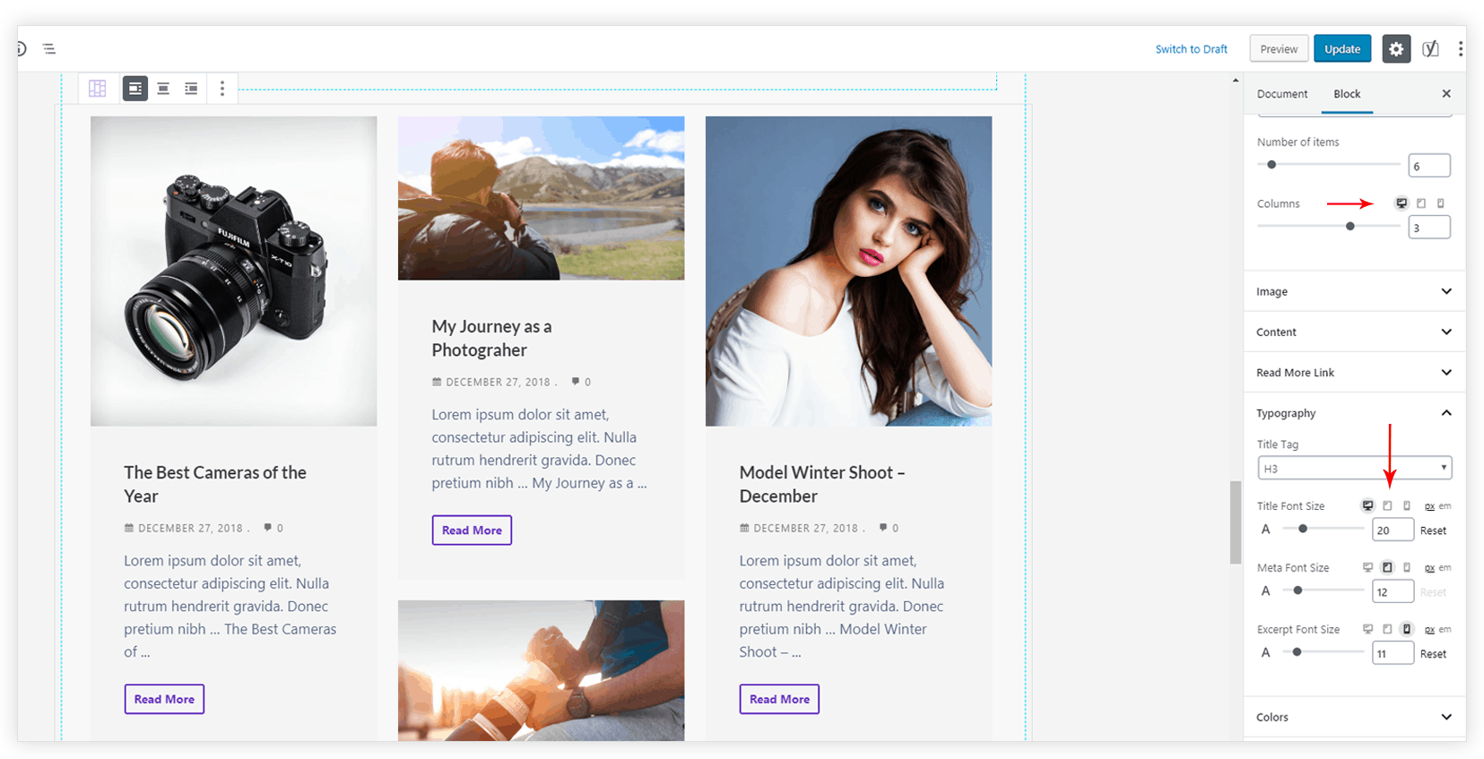
- Set different values for font size, number of columns, icon size, background size and other parameters for different devices.
- Small icons of different devices will appear beside the setting name. You just need to click on the icon and set the value.

Easy! Right?
To avail this useful mobile editing setting you just need to update the Ultimate Addons for Gutenberg to the latest version. Responsive controls will automatically appear for specific settings.
You are now free to concentrate more on the design and manage how it looks on different devices without any custom code. We are so excited that your beautiful Gutenberg pages will rock on all kinds of screens. 🙂
We would love to hear how you like this update. In case of any query write to us.

I love this application, on my website it’s great, I recommend it 100%.
Thank you! 🙂