Forms created with Gravity Form plugin can be styled up with this block. You can set the color, border, typography for various fields of the form and make it attractive.
Note: To use this block, make sure you have Gravity Form plugin installed and activated.
Key Features –
- List all available Gravity Forms, so that you can choose the required one
- AJAX Form Submission
- Tab Index for multiple gravity forms
- Predefined style for form input fields – Box and Underline
- Border for each input field with style options like width, radius, color etc.
- Typography and Color options for Content (Label, Input text)
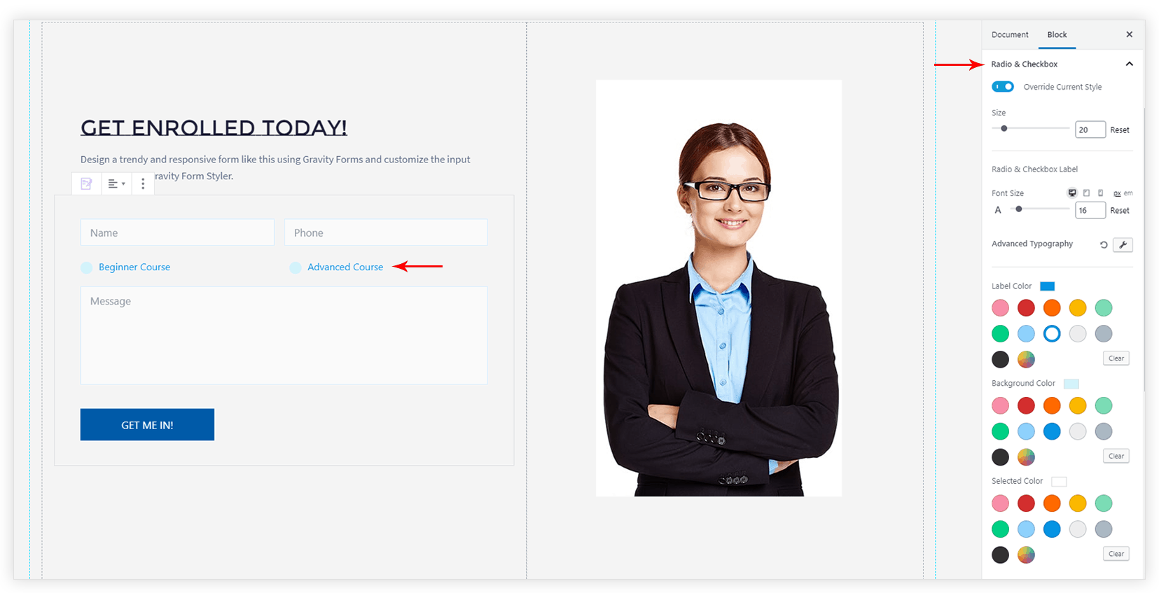
- Separate customization options for Radio & Checkbox (Size, Typography, Color, Border)
- Total customization for Submit Button
- Styling for Field Validation (Success/ Error) messages
- Spacing for all form elements

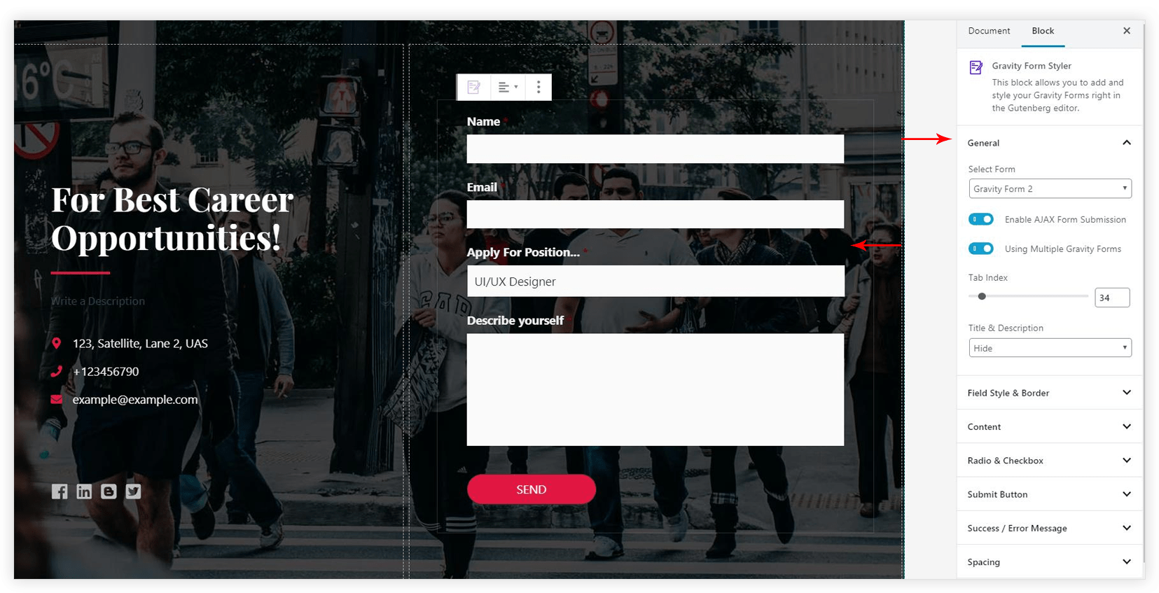
General
This tab allows choosing a specific Gravity Form from the list. Once you choose a form, you can –
- Enable AJAX Form Submission: This feature allows submitting form data in the background without page reload.
- Using Multiple Gravity Forms: If you have multiple Gravity Forms on the same page, you would need to set a Tab Index. Refer article to see how Tab Index works?
- Title & Description: A
form title and its description can be displayed.
Field Style and Border
This tab offer options to style input fields like name, email, subject, message etc. You can choose a predefined Box or Underline style, apply border and customize it.
Content
Customization options for Radio & Checkbox
If your form contains Radio & Checkbox fields you can style them according to your color theme.

Settings for Submit Button
Following settings are available for Submit Button –
- Button Alignment
- Button Font
- Border Style
- Border Width
- Border Radius
- Text Color – Normal, Hover
- Background Color – Normal, Hover
- Border Color – Normal, Hover
- Button Padding (px)
Styling for Field Validation (Success/ Error) messages
Whenever user enters input in the field, it gets validated. If it is invalid error message