Content Timeline is a flexible block that allows displaying historical events with vertical timeline items. The block contains various customization options to make your timeline attractive. You can add a title, description, icon, date to the timeline items. Color and typography options allow designing the timeline to suit your website theme.
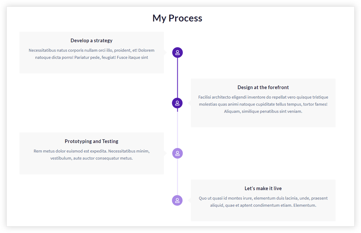
Key Features –
- Icon selector
- Layout (Center, Left, Right )
- Date settings
- Connector customization
- Colors and Typography
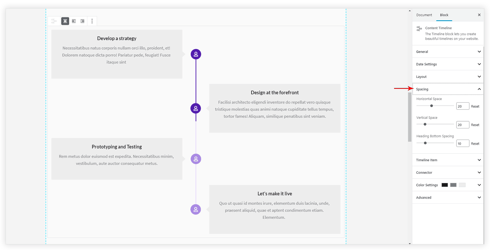
- Spacing
- Responsive Options
Under the General tab, select Number of Items to display. Each item will contain the title, description, date. This can be customized with the following option –
Icon selector
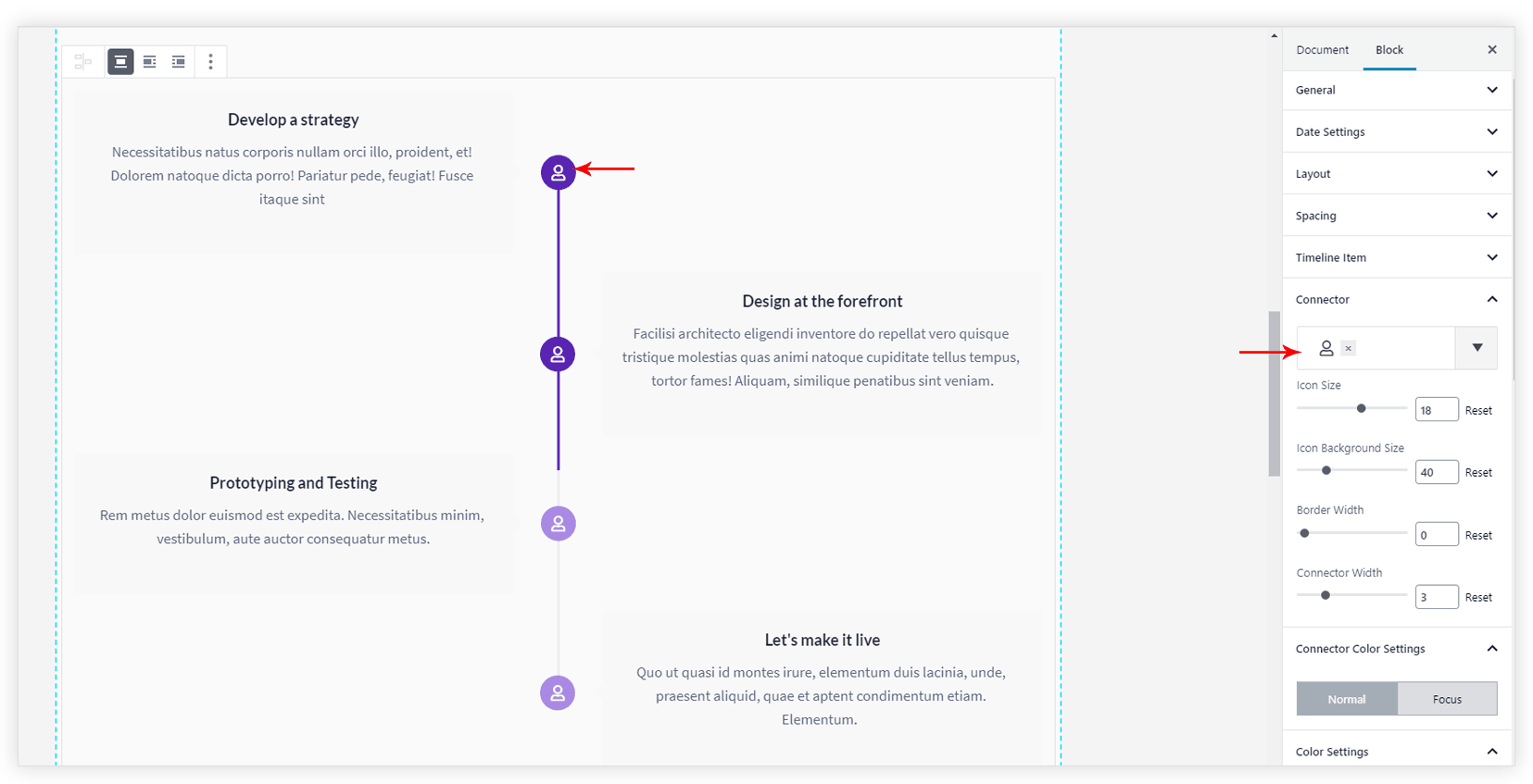
The icon for timeline item can be set from Connector tab. You get around 1400 icons to choose from. It also has the option to manage the size for the icon.
Layout (Center, Left, Right )
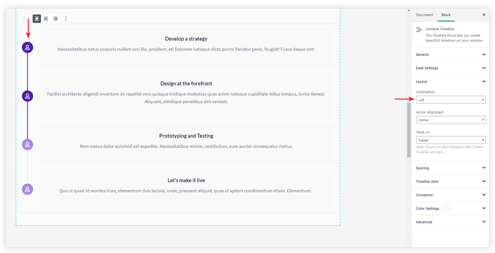
Layout for the icon and a timeline card can be set to Center, Left, Right from Layout > Orientation. Arrow Alignment can be set vertically top, bottom or center with respect to timeline card.
Date Settings
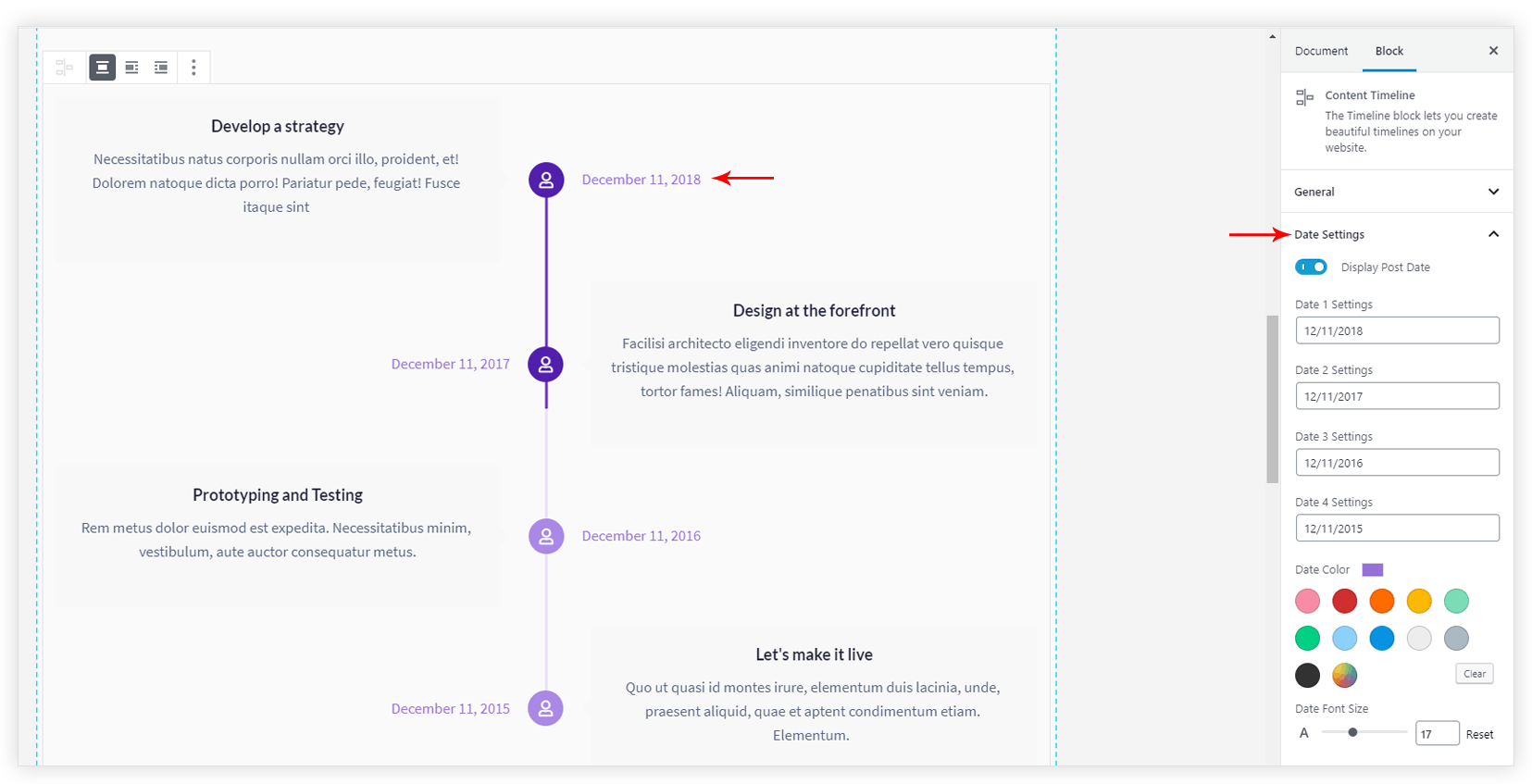
A date can be set for individual timeline card. Under the Date Settings tab turn the option ‘Display Post Date’ ON. Then add a date for each timeline card. You also get color and font size option for a date.
Connector Customization
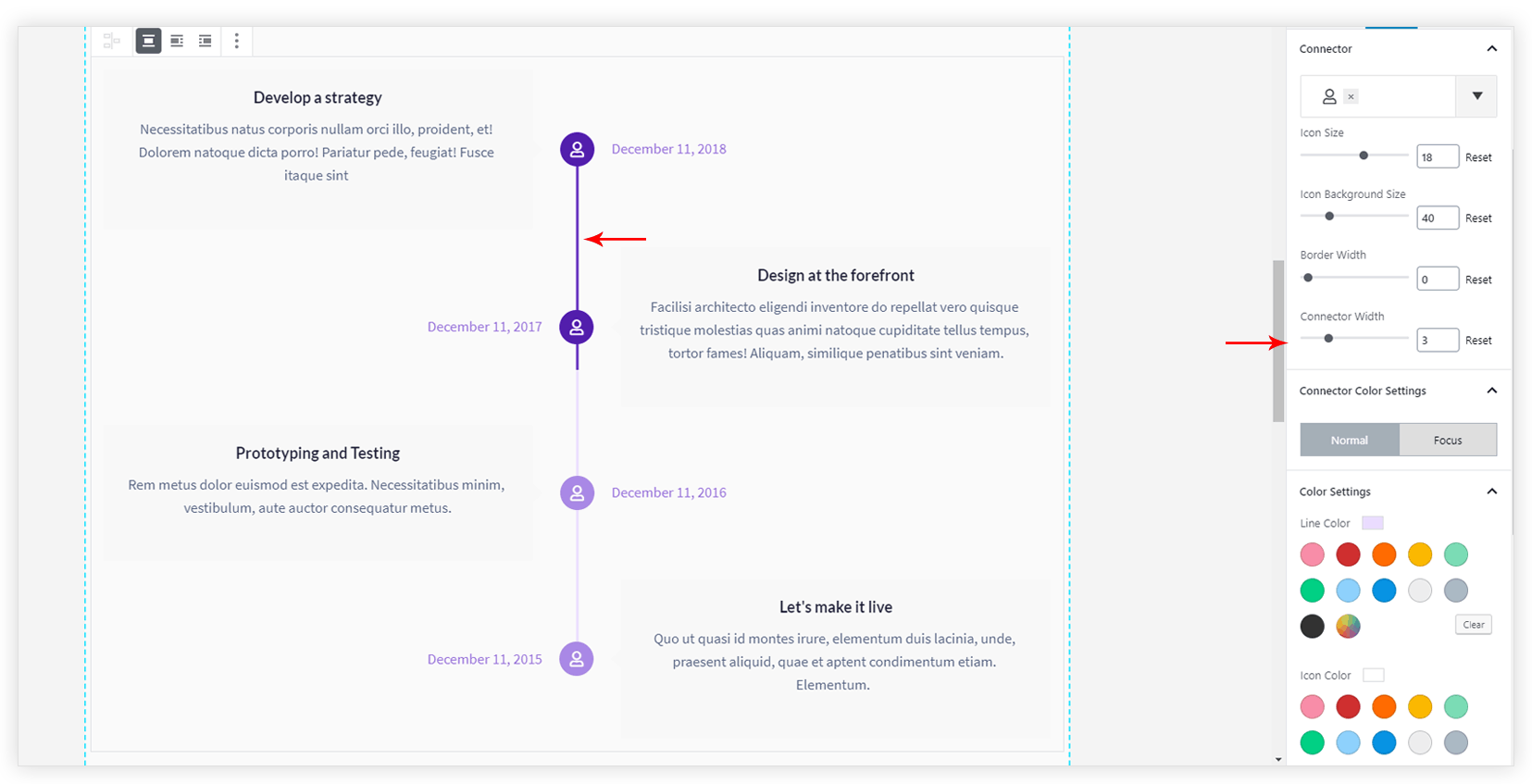
Connector includes the icon, its background, border and a line that joins two icons. Under the Connector tab, you get the option to select the icon, its background size, a border width around icon background and a connector width.
Connector Color Settings tab provides three sub-tabs for Normal, Focus and Hover colors for the icon, border, background colors.
Colors and Typography
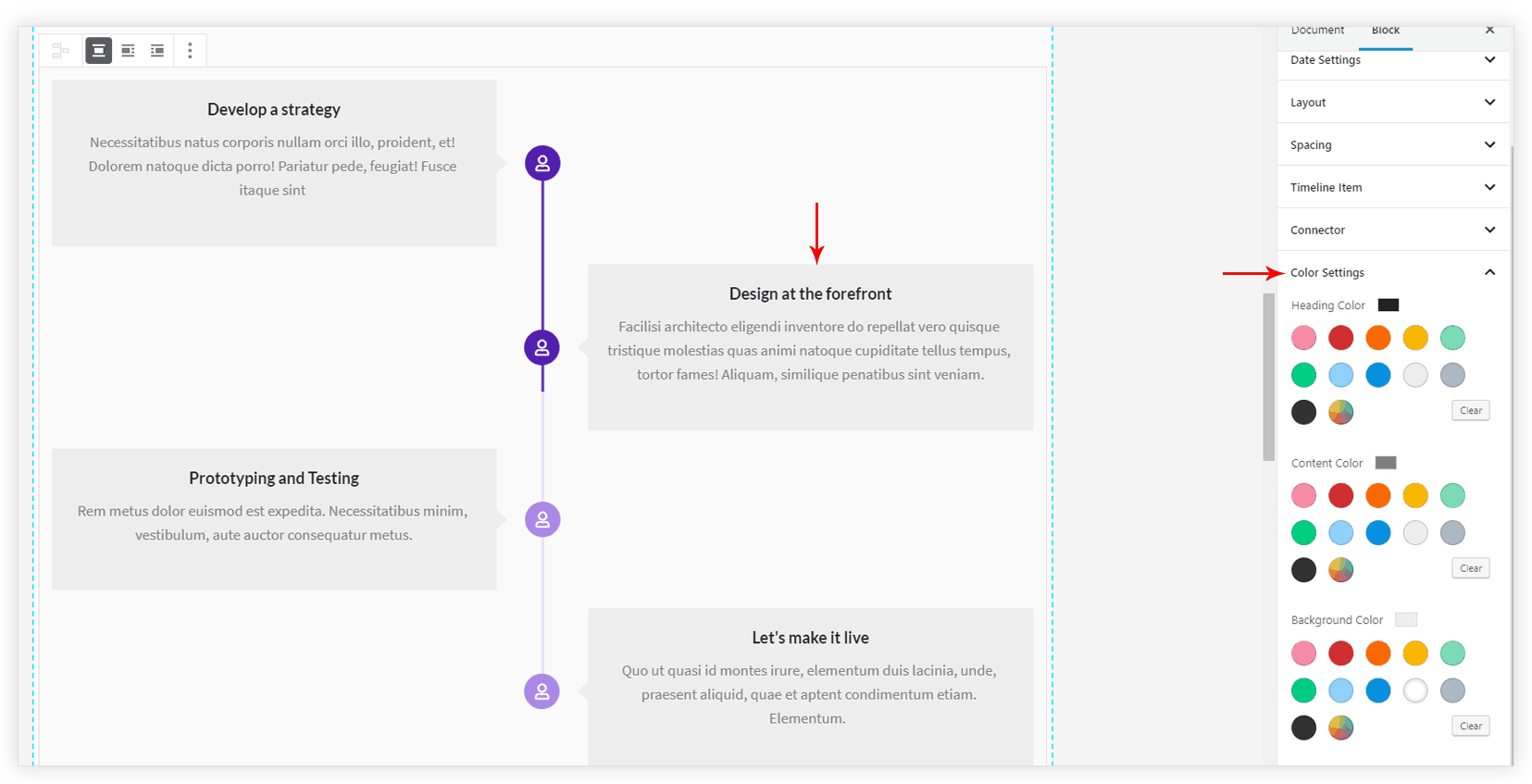
Under Timeline Item tab, options for font size and colors are available.
Spacing
Space can be managed for timeline items from Spacing tab.
Under the Layout tab, according to the layout, you can choose to stack the timeline items at responsive devices with ‘Stack on’ option.
