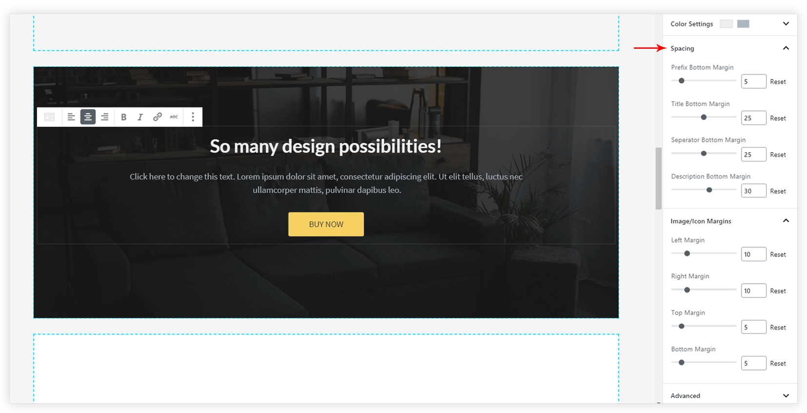
InfoBox block allows adding a heading prefix, heading, description, icon and more. All this in just a single block. Have a look at the demo here.

Key features –
- Image / Icon selector
- Image / Icon Positioning
- Ability to add Title, Prefix, Description
- Separator Customization
- Easy Call To Action
- Color and Typography options for each element of the block
- Spacing options
Image / Icon Selector and Positioning
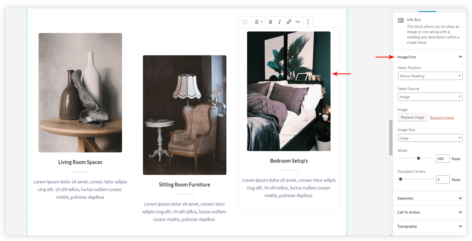
This block allows adding image/icon to the infobox. It loads full Font Awesome library with around 1400+ icons. You can choose icons from the library or can use the image. Block also provides a number of options for icon/image position. You can place icon/ image with respect to heading and description.
Ability to add Title, Prefix, Description
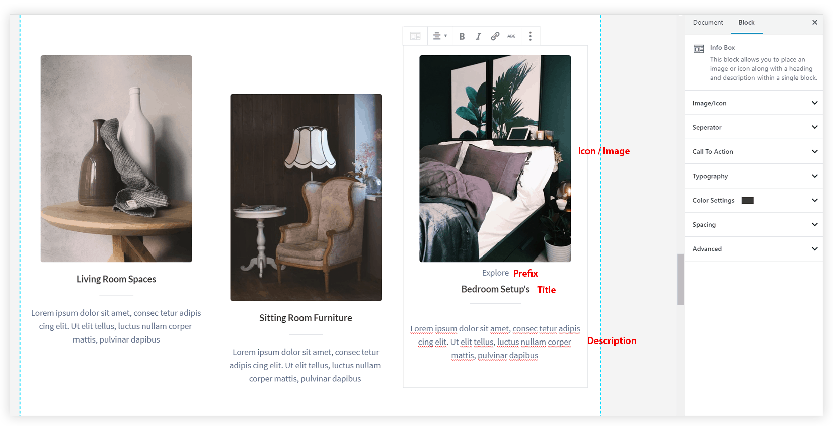
Infobox allows adding a Prefix that displays above title. Title and Description can be used to make the block more descriptive. With these options, infobox can be used as a multipurpose box. You can enter the required details and use this block to display pricing plans, features of the product, combos and much more.
Separator Customization
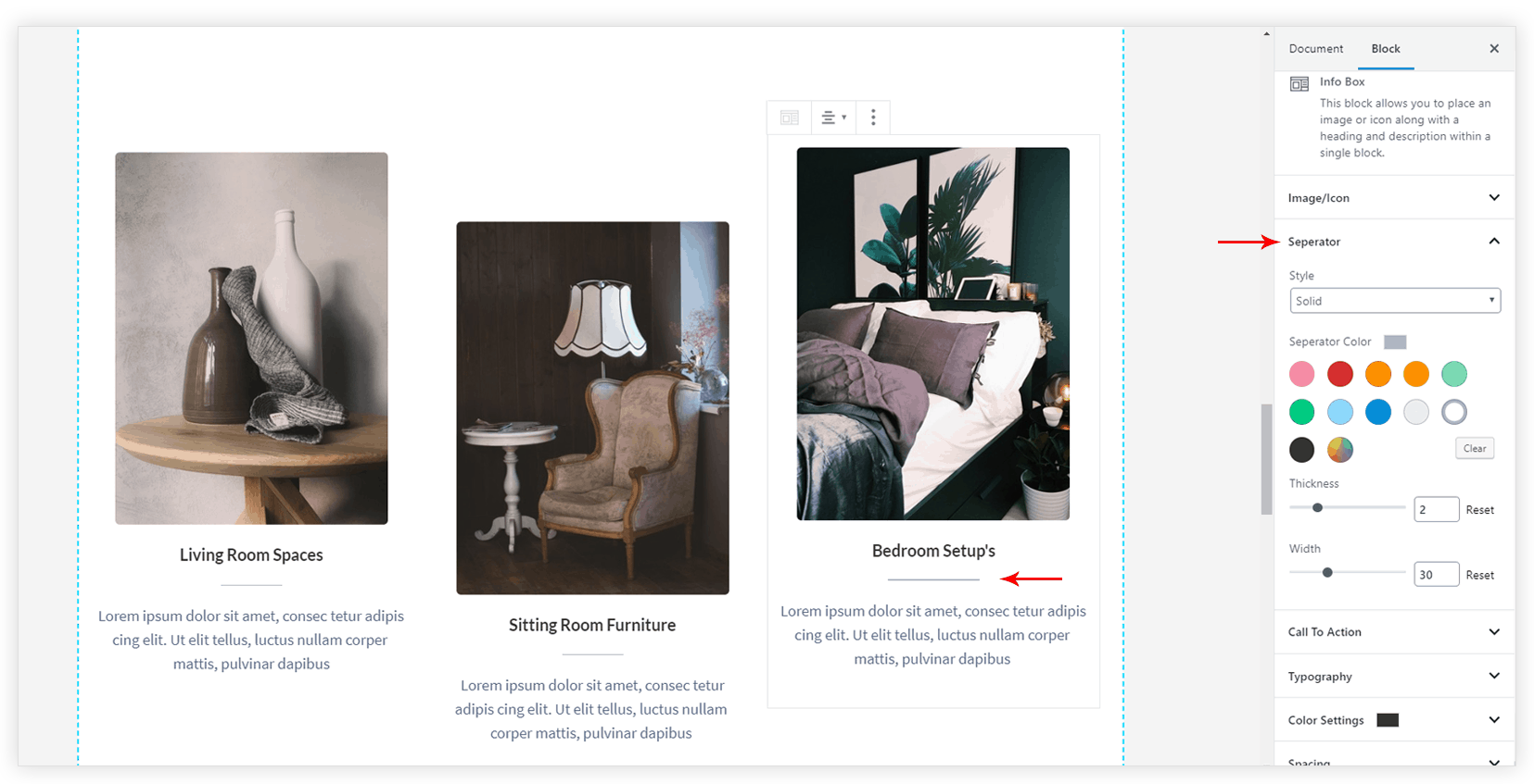
This Block provides a separator line between the title and the description. You can choose a separator style from Solid, Double, Dashed, Dotted. You can even set Color, Thickness, and Width for the separator.
Easy Call To Action
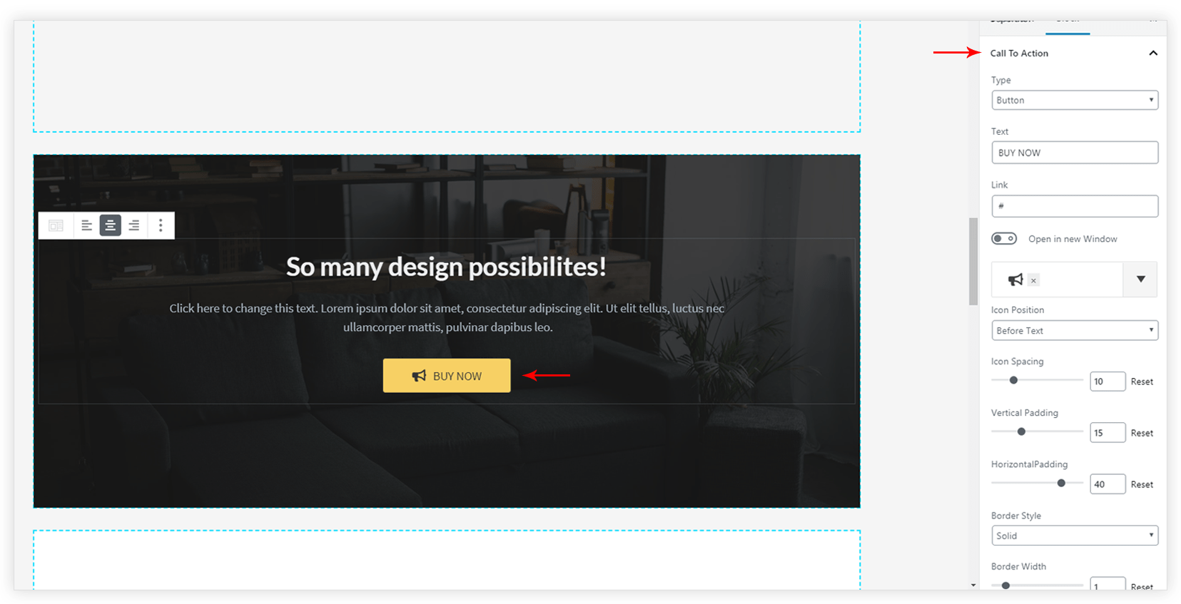
You can easily add Call To Action in form of text, button or complete box. All customization options are available for each type. Color Settings tab contains more color option for CTA.
Color and Typography Options
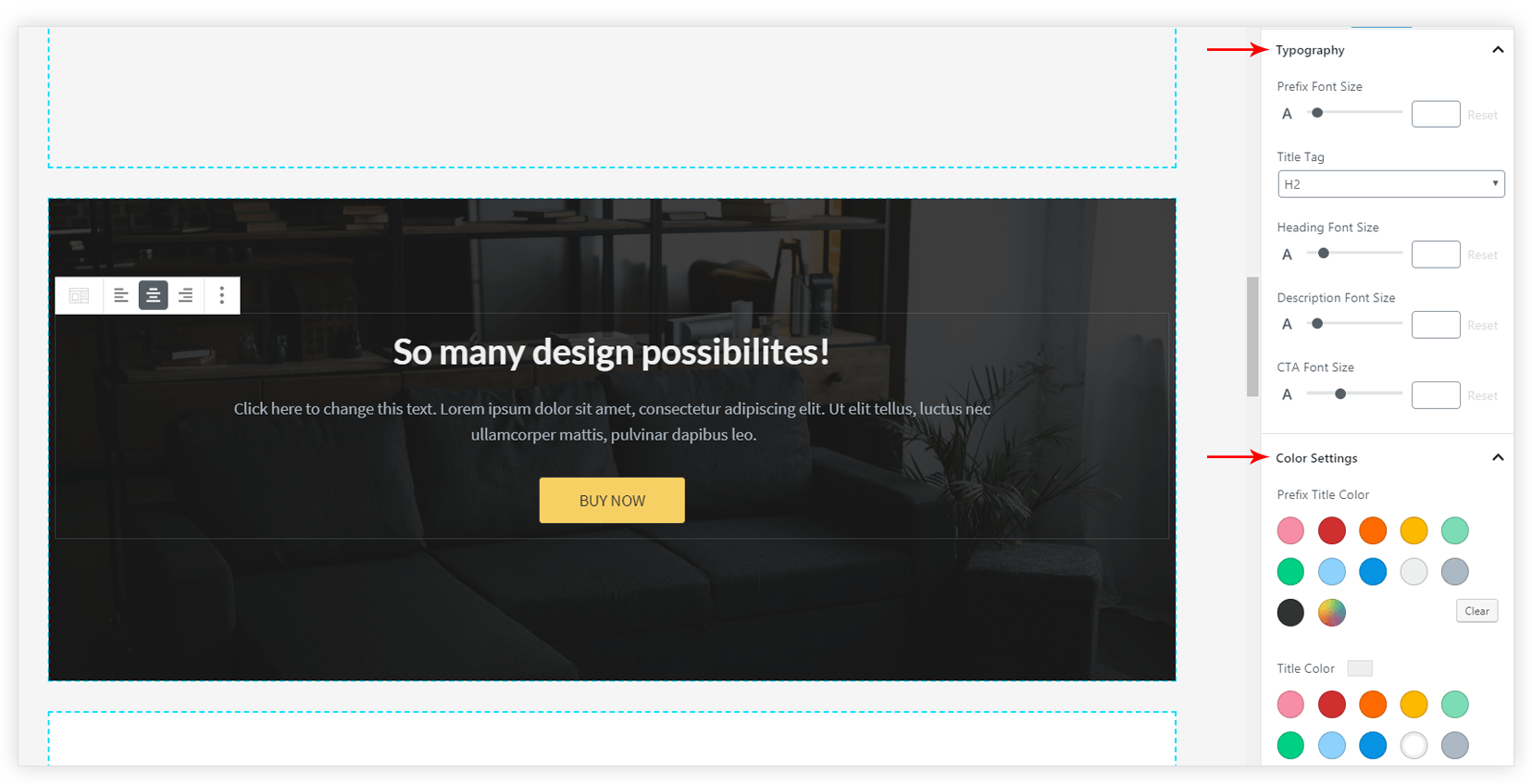
Typography tab has font size options for prefix, title, description, and CTA. Similar elements have the color option under the Color Settings tab.
Spacing Options
You can manage space between prefix, title, separator, and description. Icon/ Image spacing can also be managed from all sides.
